Tableau has a contest going on for visualizing Quantified Self data. I happen to have a fair amount of such of data from all kinds of sources on zenobase.com, so I decided to give it a shot.
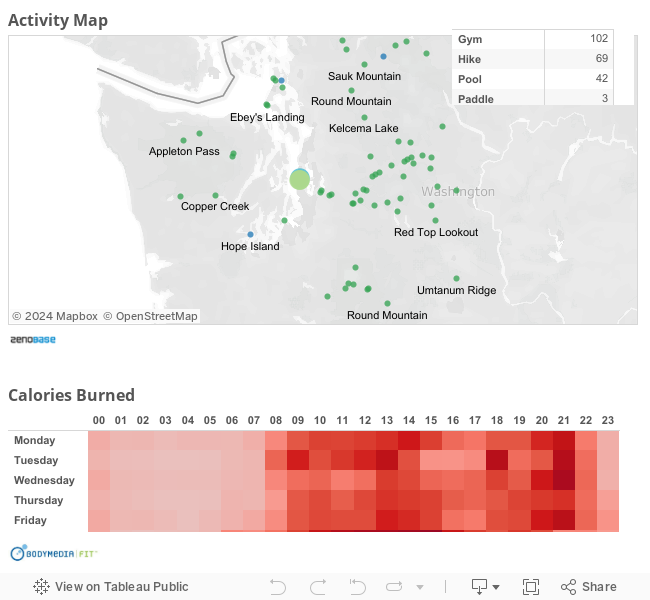
I was curious about Tableau’s geo features, and how well Tableau would handle slightly larger data sets. So I chose some outdoor/fitness activity data (which includes coordinates), and some hour-resolution energy expenditure data (~10K records).
Getting the data into Tableau was straightforward, as Zenobase exports data in CSV format. Tableau didn’t detect any data types (timestamps, coordinates, or even numbers), but that was easy to fix after the import had completed. Working with the larger data set was not a problem, either, even if the experience wasn’t exactly snappy.
You can find the result embedded below. The “dashboard” is interactive, so you can select one or more days of the week (and/or hours of the day), and the map will update to show activities that started at the corresponding time. Or you can select an activity type, or a region on the map.* Note the different patterns on week days and week ends.
* If the submission deadline wasn’t this Sunday evening, and I wasn’t on my way out to “collect more data”, perhaps I could try to show the energy expenditure on the map, and let selections on the map update the energy expenditure data below as well…